A trial firm’s website, rebuilt around the work it does in court.
Barnes Trial Group tries cases. We redesigned the site so the firm's trial focus and its attorneys come through on every page, from the first screen to the contact form.
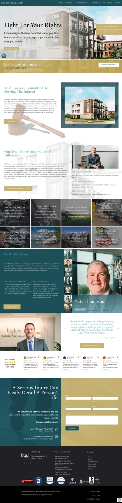
This is the live site, top to bottom. It's built to look right on every screen and load fast, especially on a phone, and the client owns all of it.
A trial firm that read like a general practice.
People looking for a trial lawyer are usually in the middle of something serious. They want to know quickly whether a firm handles cases like theirs and who will be standing next to them in court.
The previous site kept the firm’s trial focus in the background. The layout and messaging read like a general practice, so visitors had to dig to learn what the firm actually does.
Every page leads with trial experience.
We rebuilt the design, messaging, and page order around one idea: this is a firm that tries cases. The attorneys and their credentials sit near the top, where people look first.
The content speaks to litigation directly, so a visitor knows what kind of firm they have found within a few seconds of landing.
Authoritative, and direct.
The design is confident without being cold. Sharp typography, a strong color treatment, and a clear hierarchy reinforce the firm’s positioning on every page.
It is direct and self-assured, much like the firm itself.
A site that says what the firm does, on every page.
The finished site presents Barnes Trial Group the way the firm sees itself: a trial team, with its attorneys and its focus up front.
Every page is built mobile-first and easy to move through, so someone reading on a phone in a stressful moment can find the firm’s focus and a way to reach it.
A closer look
Here's more from the build.


Want a site that works this hard for you?
We learn your business and build the whole system around what makes it different. If your website is underselling your work, let's fix that.
Let's Talk