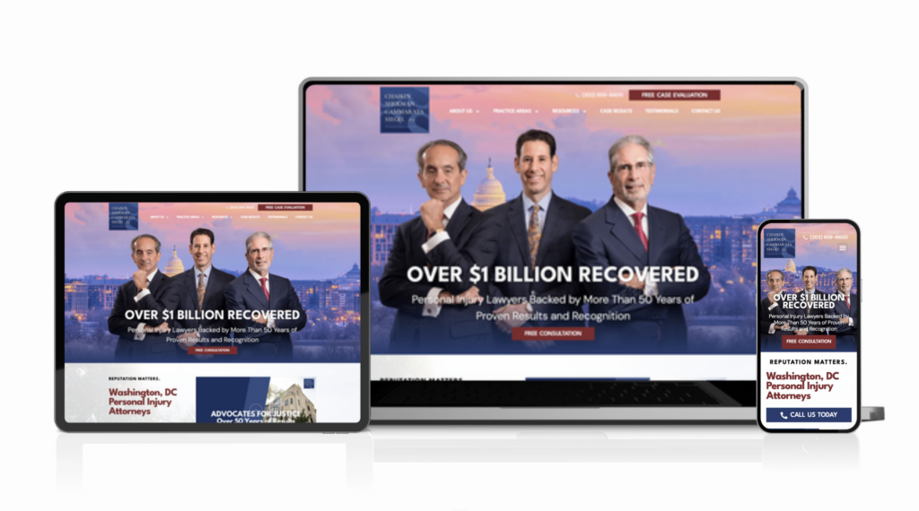
Solo practitioners in personal injury law face a credibility challenge. The market is crowded, and injured clients are making one of the most important decisions of their recovery. They need confidence that the attorney they choose knows what they’re doing. Gary W. Johnson had been practicing for [X years], but his online presence wasn’t reflecting his actual experience and track record. His previous website was dated, designed in an older aesthetic that signaled outdated thinking. Mobile experience was poor, navigation didn’t help clients understand his practice areas, and the messaging was generic legal copy—not the positioning of a serious trial lawyer. He needed a website that showed injured clients they were in the hands of someone who knew how to win.
What We Did
We repositioned the site around trial law expertise. Instead of generic personal injury language, the site demonstrates deep knowledge in specific areas: car accidents, workplace injuries, premises liability. The content answers the questions injured people ask at 2 AM when they’re scared and searching: “What happens next?” “How long does this take?” “How much is my case worth?”
The design reflects authority without coldness. Navy + gold color treatment signals trust and stability. The layout is clean and spacious, because decision-making under stress needs clarity, not information overload.
Information architecture is structured around case types, not practice areas. A client injured in a car accident lands exactly where they need to be, seeing content tailored to their specific situation. This approach reduces confusion and builds confidence faster than generic legal copy.
We also built practice area pages, attorney credentials with schema markup for search visibility, a comprehensive FAQ section, and clear conversion paths throughout.
Design Approach
The visual identity needed to say: this is someone serious about trial law. Navy conveys tradition and authority. Gold adds warmth and confidence. The serif typeface reinforces stability and legal expertise.
The layout itself is strategic. Generous whitespace, clear visual hierarchy, and strong typography mean browsers can navigate the site without friction. Every design decision points toward one goal: building enough confidence that an injured person picks up the phone.
The Results
Contact form submissions increased [X%]. Mobile traffic grew from [X%] to [Y%] of total visits. More importantly, the leads coming through the form are more qualified—people who’ve seen the site, understood his positioning, and know they’re calling the right person.
Ready to build something like this?
Every project starts with a conversation. Tell us about your business and we’ll tell you what we’d do.